Brand Identity & Visual Systems Development
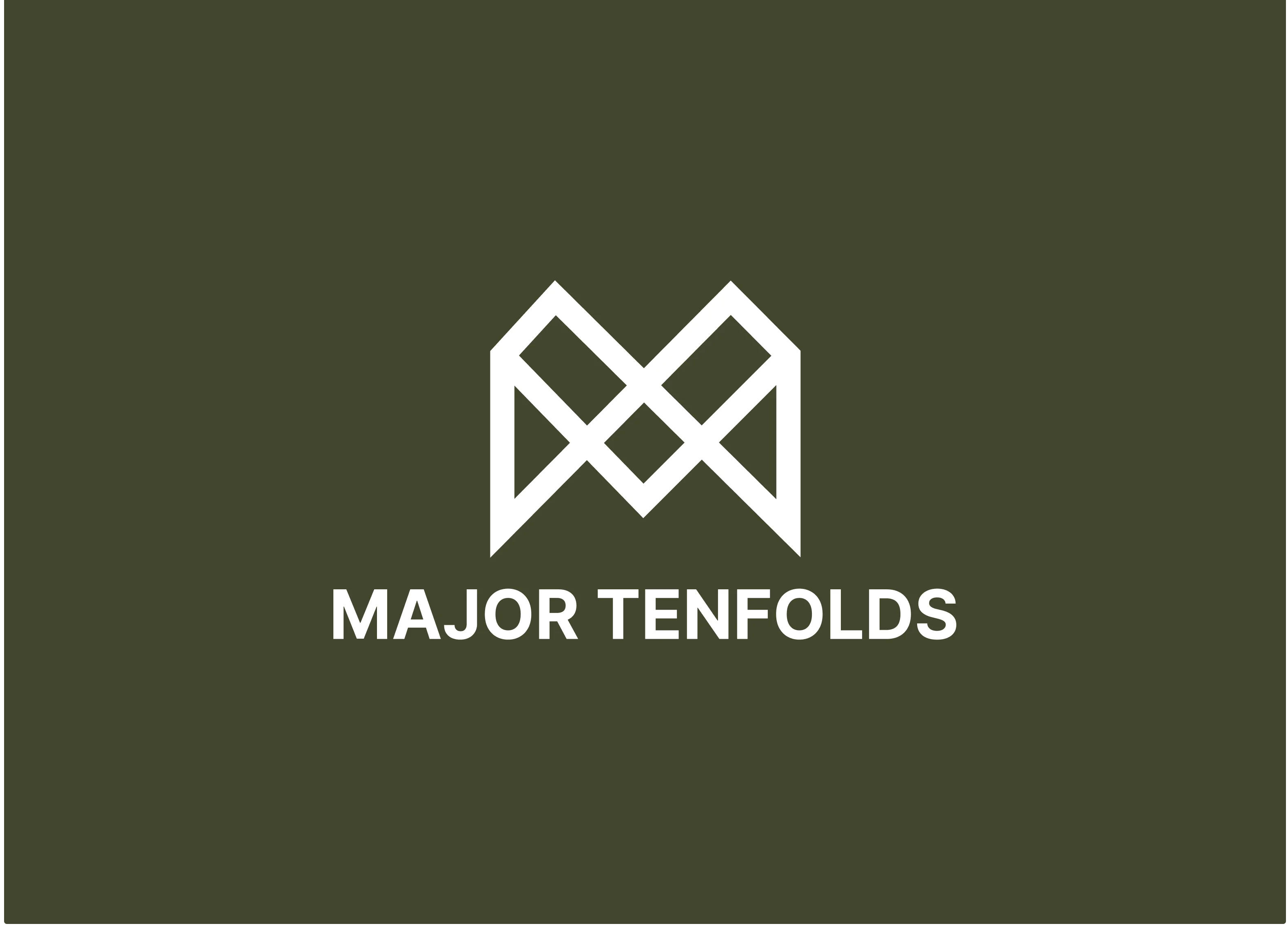

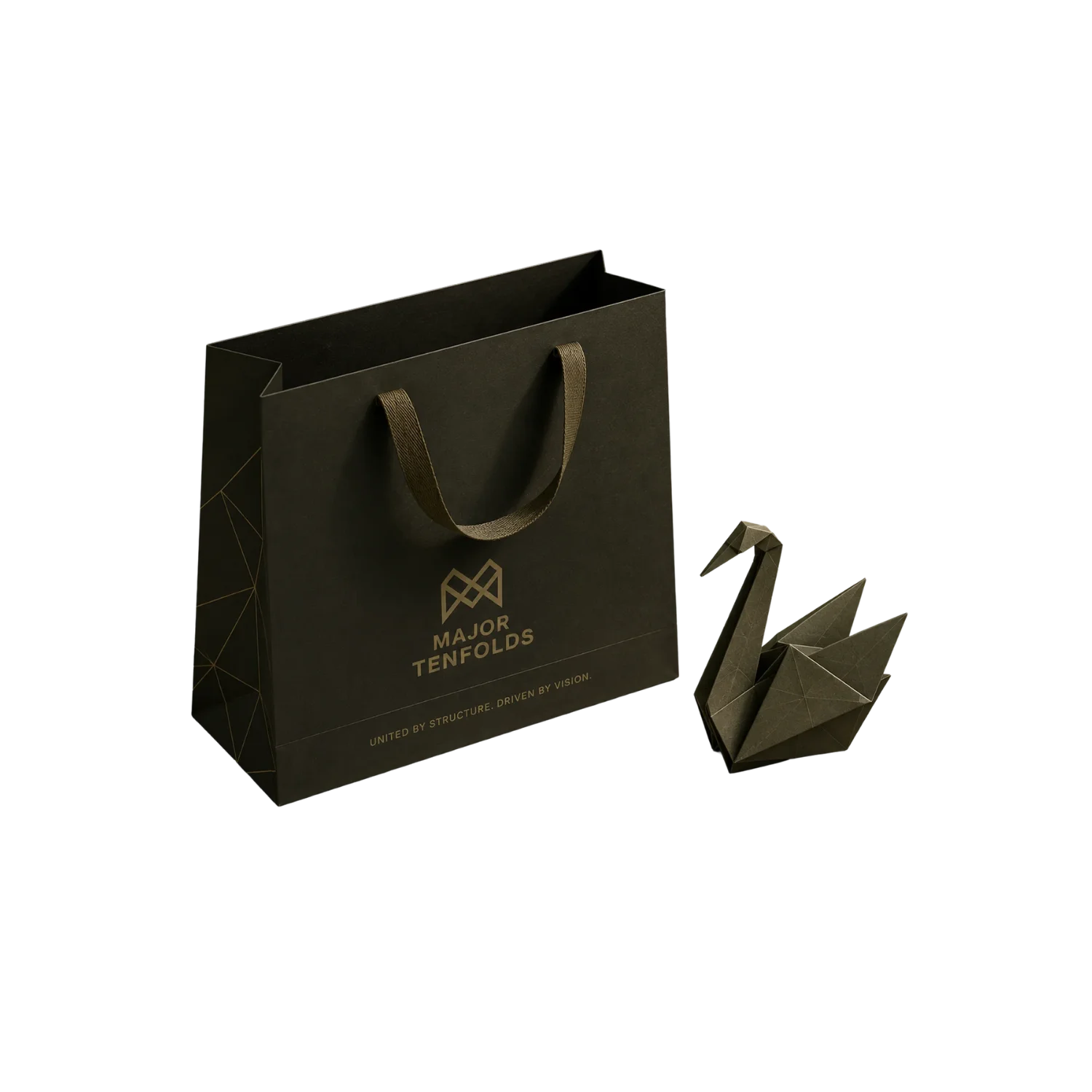
As a holding company, Major Tenfolds required a brand identity that could command authority and stability. The primary challenge was to create a visual language that was highly memorable and modern, yet maintained the formal and prestigious tone required of a corporate parent company.
- The primary objective was to capture the essence of a professional and stylish holding company. Key goals included:
- Developing a visual identity that balances "memorable" with "formal."
- Creating a cohesive design system that reflects the strength of a holding company.
- Establishing a set of brand assets that could be used across various touchpoints.
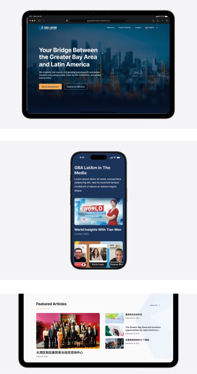
Our Strategy, Approach & Solutions
The Studio followed a structured, iterative design process to translate the client's high-level vision into a concrete brand identity:
Discovery & Mood Boarding
The process began with a discovery call to understand the client's core values, followed by the development of mood boards to establish a clear visual direction.
Iterative Design
We moved through logo direction phases and a meticulous color palette selection to ensure the aesthetic aligned with the client's professional standards.
Systematic Delivery
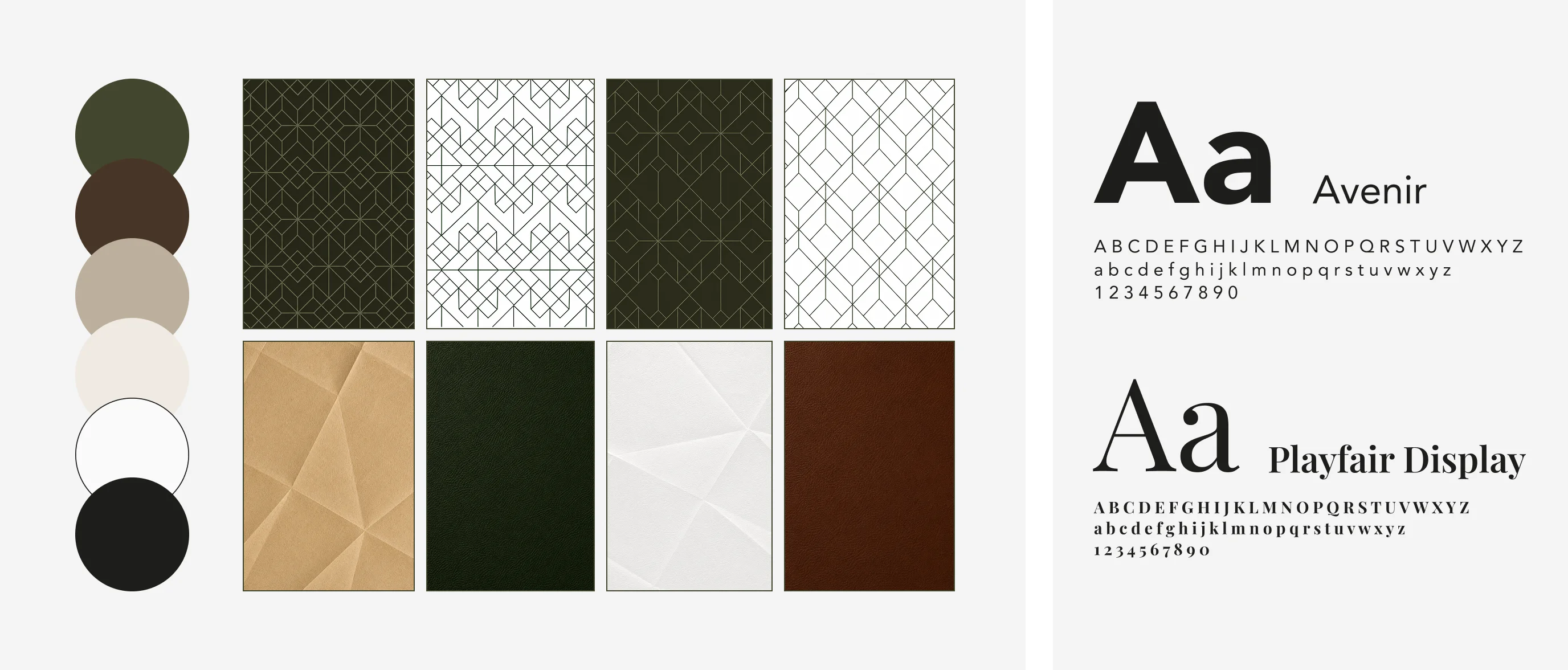
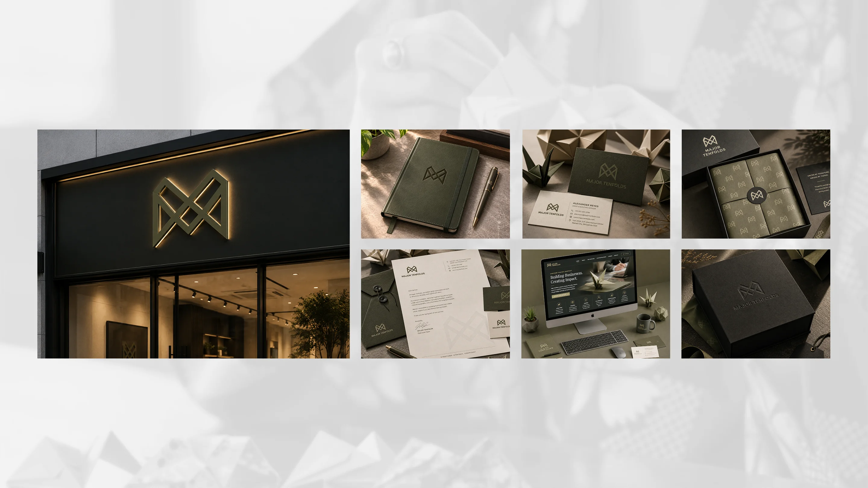
To ensure long-term usability, we developed a comprehensive Brand Toolkit, including typography, imagery, and essential vector files (PNG & SVG) to ensure the brand remains consistent across all corporate communications.

Results & Impact
The final brand identity and imagery perfectly matched the vision the client had in mind but was previously unable to express. The project resulted in a sleek, professional, and sophisticated brand image that meets the client's exact expectations for a high-level holding company.